Project overview:
To enhance customer experience, I expanded Greene King’s existing icon library to visually represent new facilities and services, like EV charging and family play areas.
By maintaining stylistic consistency and clarity, the updated icons align with the brand’s identity while improving customer navigation and understanding of available amenities.
My Role
I led the icon design task, from initial research to final delivery. I studied the existing icon library, designed new icons for additional facilities, and conducted three rounds of user validation to ensure clarity and consistency.
This iterative process helped achieve the best results and enhanced the user experience.
Iconography
Pub home page
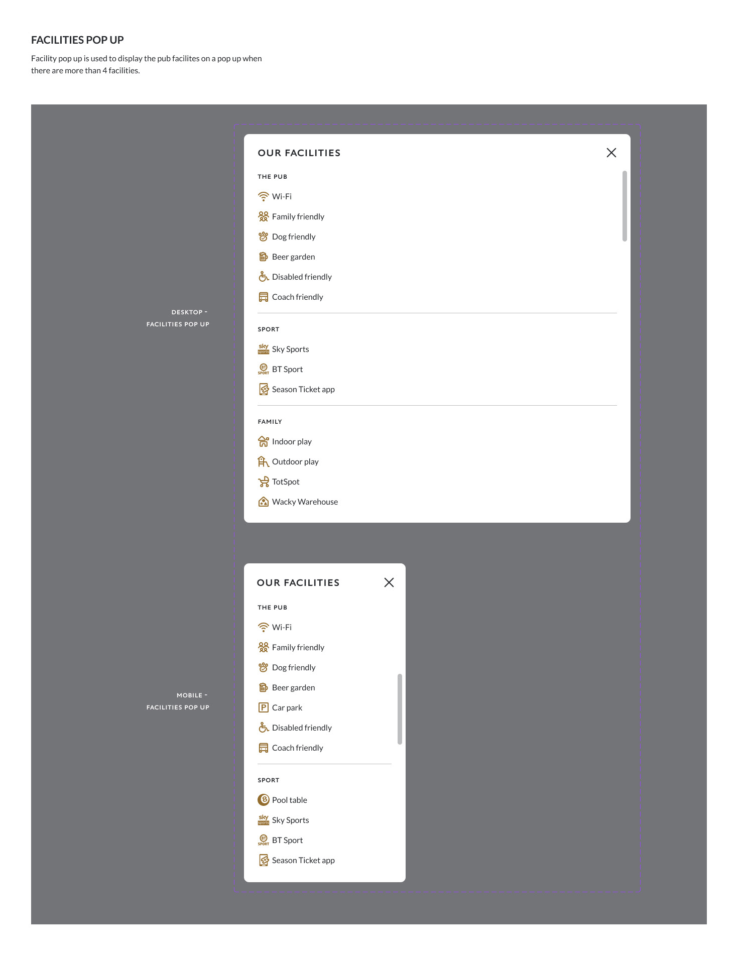
I integrated the new icons into Greene King's design system, ensuring they adhered to established guidelines and maintained visual consistency.
These icons are now utilised across all digital touch-points, enhancing brand coherence and improving user navigation and accessibility throughout the services.
Design system example 1
When creating components in Figma, I design a versatile base component that aligns with the design system. I then make three key variants—black, Gold, and White—catering to different use cases and ensuring consistency across various themes and backgrounds.
Each component is built with reusability in mind, using features like auto-layout and component nesting to streamline future updates and maintain design cohesion. This approach ensures flexibility and efficiency in all ongoing and future design projects.

Design system example 2
