Brief
Redesign landing page for WorldLabs, an innovation platform.
Problem statement:
User found it hard to understand what does the platform do. We aimed to redesign the landing page based on the business goals and make it easier to understand.
My role
I led all design assets, art direction and project management throughout this project.
Firstly I had a discussion with the sales team to gain some first hand information of the clients and users. I studied and analysed the issues and did research.
Once I confirmed our business goals with the team. I created a new structure with wireframes. After that, I proposed the ideas to the CEO and copywriter.
Once we agreed with the new structure and wireframes. I transferred the branding elements into the interface. I presented the final design to the whole team and then move on to development. I worked closely with the developer to make sure everything was going well as planned: including, css animation and UI animations.
Process
• Briefing
• Research
• Brainstorm ideas
• Structure & wireframe
• Present to CEO
• Interface design/illustrations/UI animation
• Present to the whole team
• Manage developers
• Final polish(CSS)
• Present final outcome
Objective
What is WorldLabs?
short description to explain what we do
Why WorldLabs?
What makes us unique? show values and what can we provide
What can user gains from using the platform:
• Networking/join communities
• marketplace - find/offer
• Share ideas
• Join event/oportunities
• What else?
Target audiences
Individual(B2C)
Networking, share ideas, get inspired, join communities...
Universities/Organisations/Companies(B2B/B2B2C)
Build their own community page(custom landing page), invite member(s), share ideas/files with your members.
Run opportunities/Events(B2B/B2B2C)
Create & manage your own opportunity/event within your community
Structure & Wireframe 1
User found it hard to understand the old landing page because we were too focused on selling features but forgot to tell the user the reason and why. I want to make sure the user to understand the value of the platform:
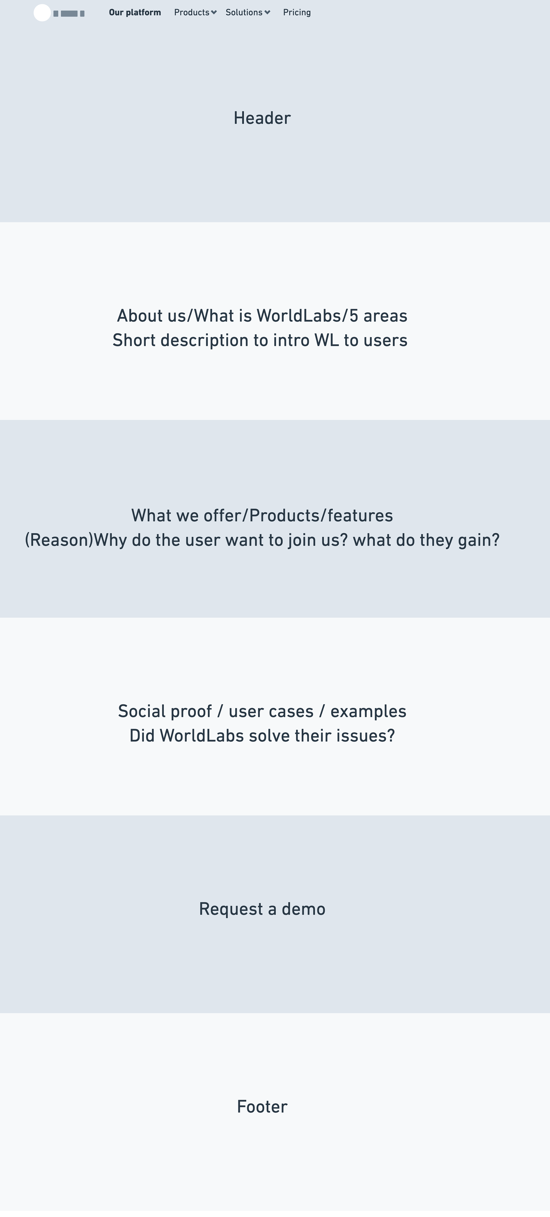
Structure draft 1

Wireframe

Wireframe

Wireframe
Wireframe requirements
Header
Big and bold animated title to catch user attention
Animated user interface to show an overall view to the user
What we offer
B2C - This link to sign up
B2B(contains 3 Products) - This link to B2B landing page
What you can do (all key features)
Our mission (goals and links to B2C & B2B)
Join us (eye-catching section with CTA)
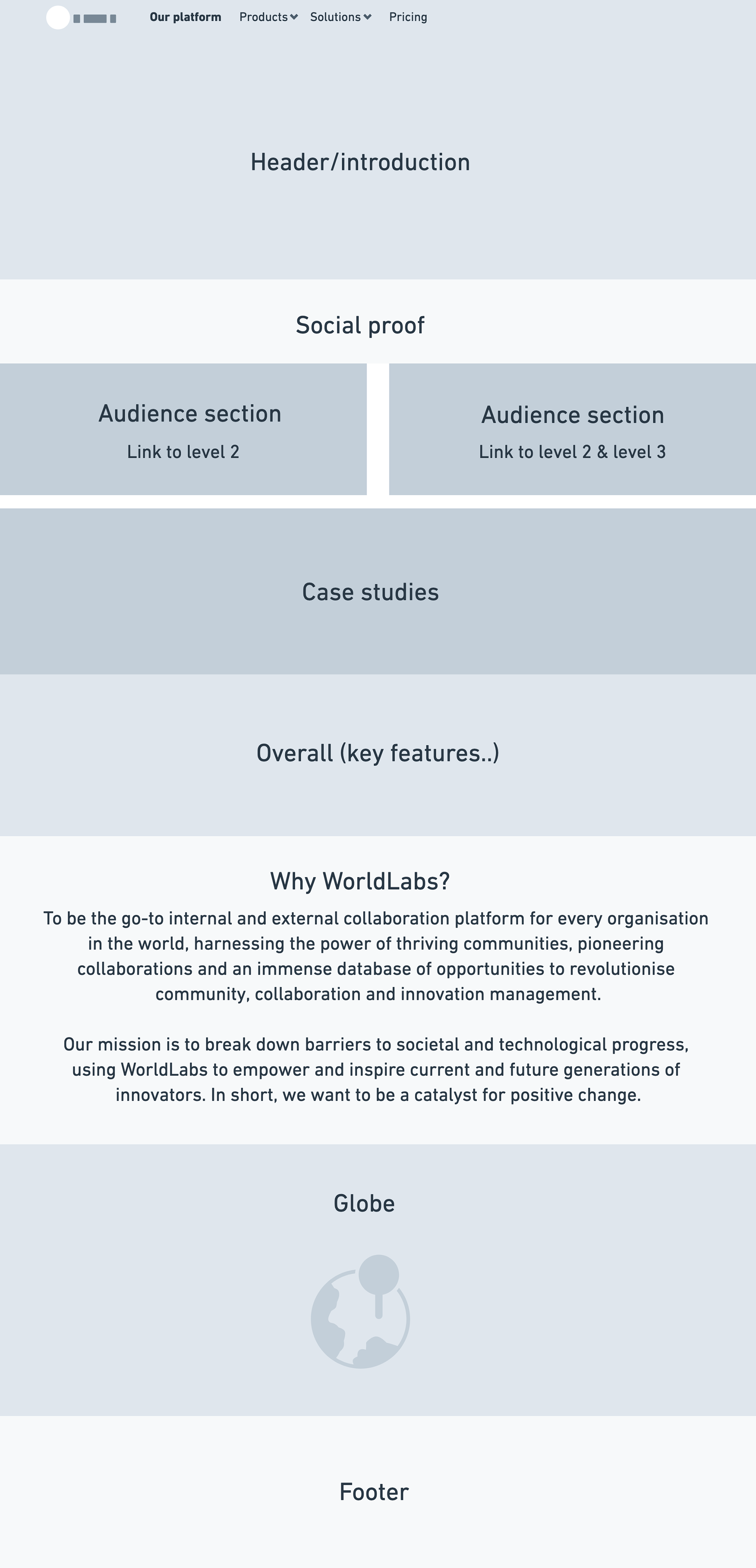
Structure draft 2
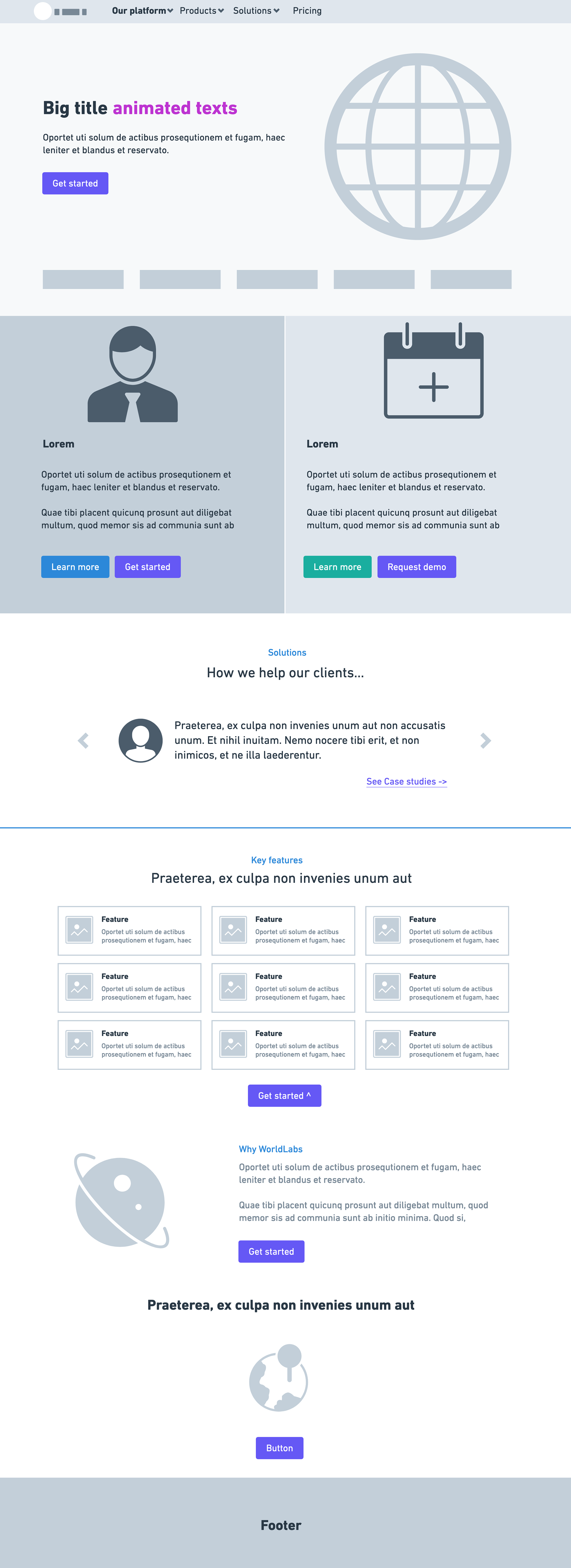
FInal wireframe
Interface design & Art direction
I looked into the brand identity to see what design elements to use for the interface. I played with the brand colors and shapes to create eye-catching visual to the landing page.
Color experiment








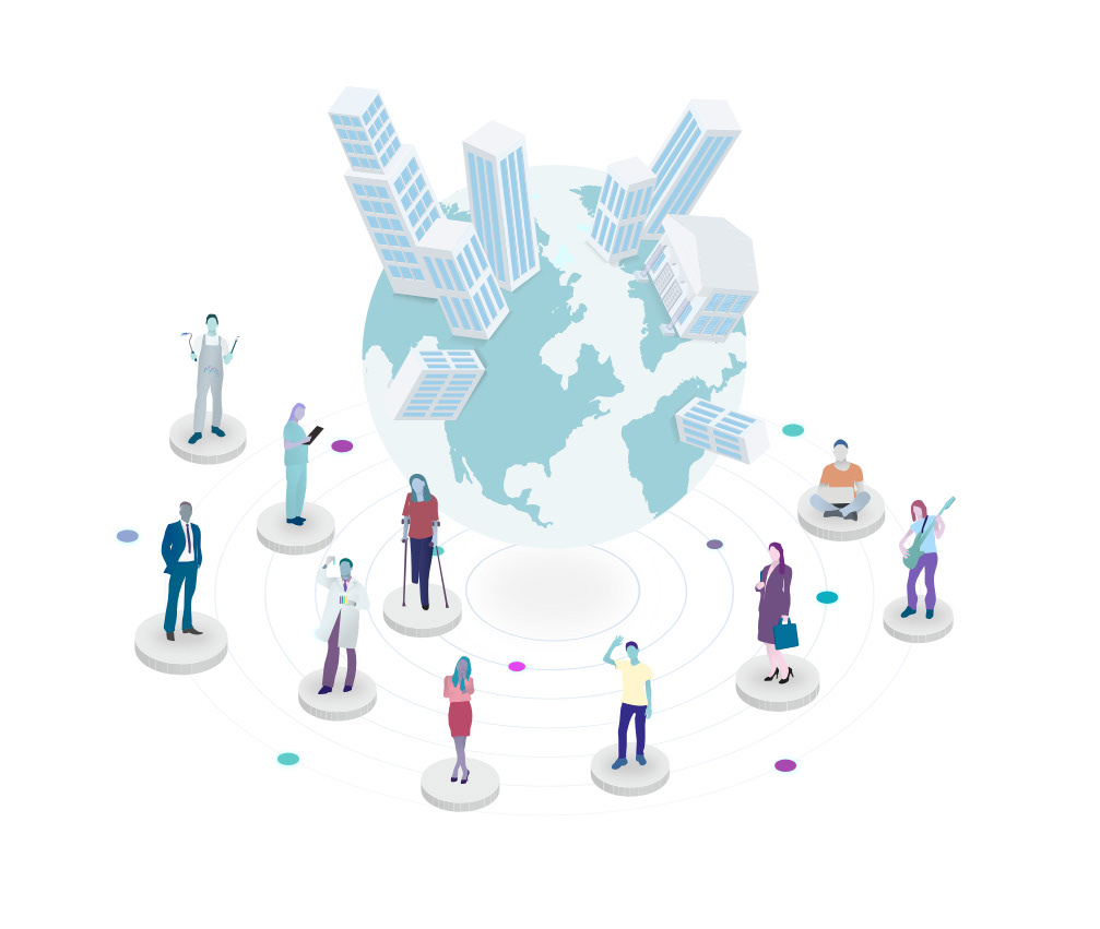
Isometric illustration & Interface animation
In order to make it more interesting. I have decided to create an interface animation to the header. That allows the user to have an idea and overview of the platform by not going into too much details.
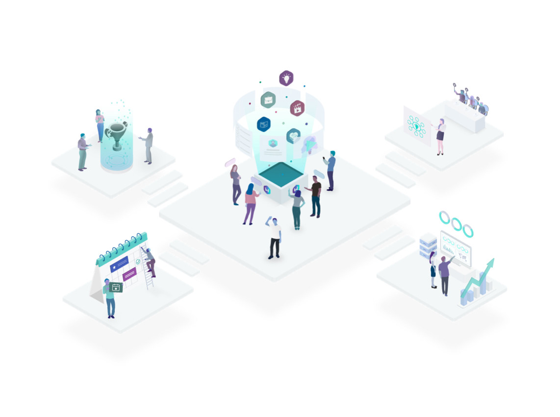
Landing page
B2B landing page